

Branding Agency for Health, Cosmetics and Personal Care
In health and cosmetics, people have to trust the packaging and the brand before they ever try the product. As a branding agency, we design identity and packaging systems for cosmetics, personal care and supplement brands that build that trust at first glance, on the shelf and on screen.
The Industry's Brand Problem
The real challenge for health and cosmetics brands is building trust in a single glance. Before using a product, people judge the active ingredients, the formulation and how seriously the brand takes itself, and most of that judgement happens in a few seconds, on the shelf or in an online listing. That makes packaging the most important communication tool in the category. However good the formulation, if the pack does not inspire confidence, the shopper moves on to the next product on the shelf.
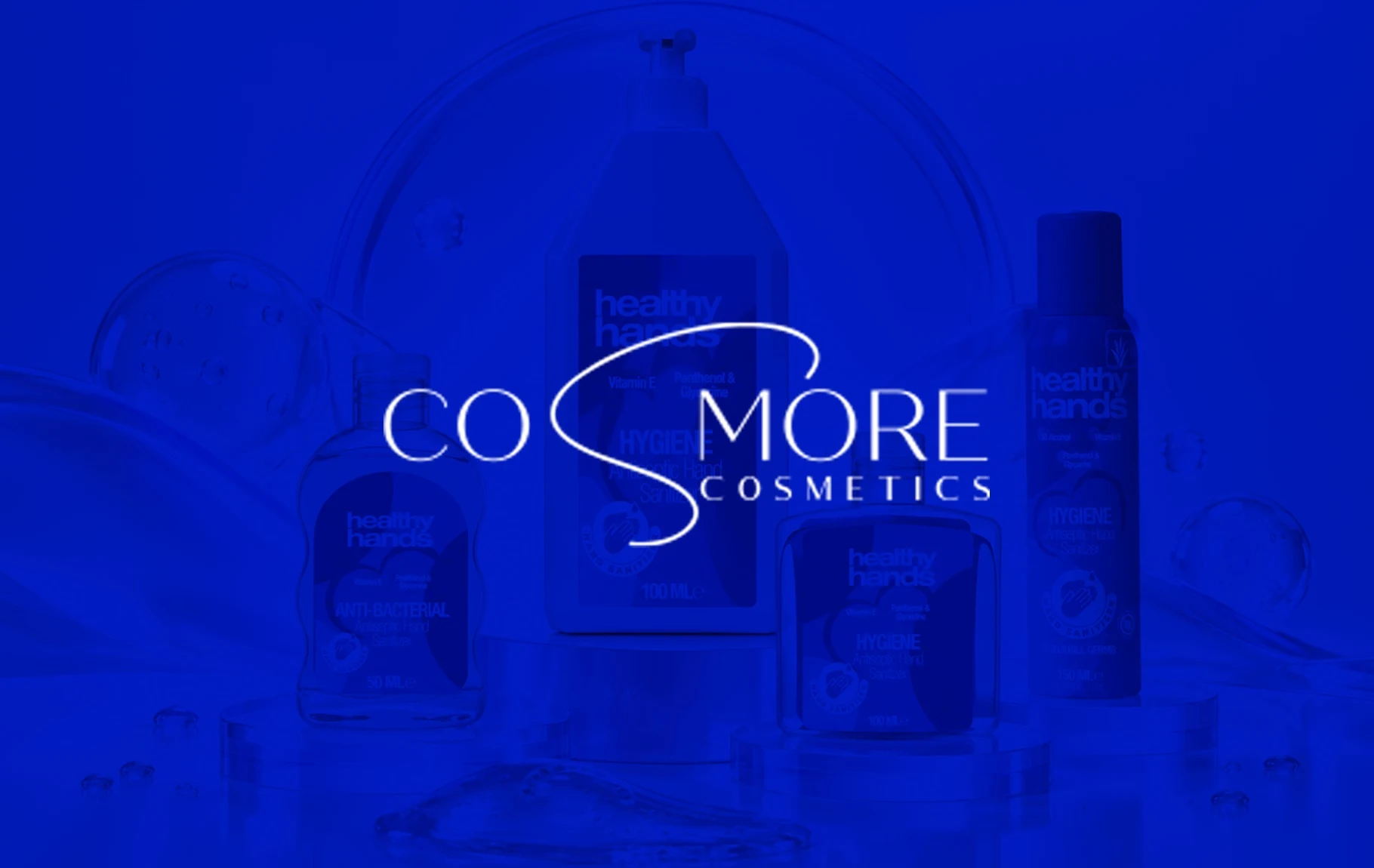
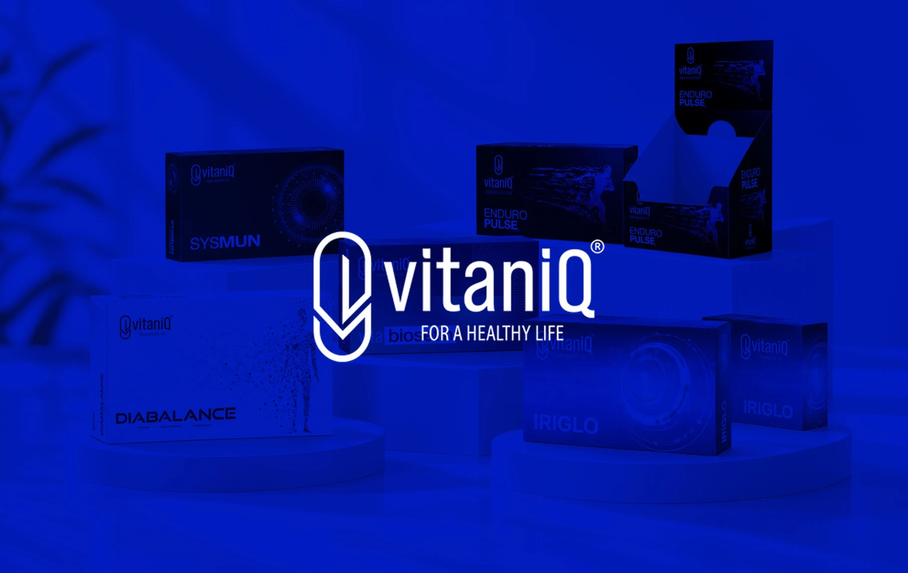
The second problem is getting caught between two extremes. That was the picture Cosmore faced in the hygiene and antiseptic aisle: on one side, a cold and overly chemical medical language; on the other, amateur labels that inspire no confidence. Vitaniq faced a similar balance, where cluttered labels confused people and overly sterile designs felt distant.
The third problem is the boundary set by regulation. In categories such as cosmetics and food supplements, what can be said on pack and in advertising is limited by the relevant legislation, and claims to treat a condition are generally not allowed. Where it cannot lean on a bold benefit claim, a brand has to show its difference through design, clarity of information and consistency.
Finally, there is range growth. As a line expands from pocket sizes to pump bottles, or from immunity to energy, each new product starts to look like a separate design. When shoppers cannot find what they want on the shelf, the brand's variety stops being an advantage. When it is not clear how the range is organised (by need, active ingredient or area of use), colour and naming end up random too.
How We Approach It
01
Trust and freshness in cosmetics packaging
We create a colour, form and typography language that brings clinical credibility and cosmetic freshness together on the same pack. Active ingredients and key benefits stand out in clear badges, while the brand feeling carries in the background without overpowering the information. The palette and forms are chosen to signal the category at first glance without copying the competition.
02
An information hierarchy that reads at a glance
We arrange information such as active ingredient content, dosage and daily serving in an infographic layout shoppers can grasp quickly on the shelf. Because mandatory information and brand space are planned together from the start, the pack does not become cluttered. Shoppers get to the essential information without having to turn the pack around.
03
A range system that can grow for health brands
Using colour codes based on health need or product type, we design a packaging system where every new product launches as part of the same family. The same system works just as clearly on the pharmacy shelf, in retail chains and in e-commerce listings. Product photography and e-commerce visuals follow the same system's rules.
04
A distinctive voice within regulatory limits
We build packaging and social media copy around ingredients, usage and experience rather than claims. Final wording is always agreed with the brand's regulatory lead or legal adviser; our job is to create a distinctive voice within those limits. This division of labour also reduces the risk of a creative idea being rejected at the publishing stage.
Our Work in This Industry
Brands We Work With in This Industry

Frequently Asked Questions
What matters most in cosmetics packaging design?
Cosmetics packaging first has to get noticed on the shelf, then inspire trust up close. Colour and form should meet category expectations while still standing apart from competitors, and the active ingredient and main benefit should read at a glance. Keeping the same system across sizes and formats makes the range look like one family on the shelf. Packaging material and printing technique also affect perceived trust, so design should be considered alongside these technical choices.
What information should stand out on supplement packaging?
With supplements, people first look for what the product is for, what it contains and in what amounts, and how to take it. Presenting this in an infographic layout makes the decision easier at the shelf. Because mandatory information and permitted wording are set by regulation, the copy should be confirmed with expert advice before design begins.
What can health brands say in their advertising?
For health-related products and services, advertising and claims rules are set by legislation that varies by category. In general, promises to treat a condition, guaranteed results and unproven claims are risky. Copy should be checked with the brand's legal or regulatory adviser before any campaign goes live; as an agency, we build a creative voice within that framework.
What does corporate identity cover for a cosmetics brand?
For a cosmetics brand, identity goes beyond the logo and colours to include the packaging system, product photography style, e-commerce visuals and social media templates. Because people usually meet the brand through the product first, how the identity works on pack should be designed from the outset. The guidelines should also define how the identity is applied across pharmacy, retail and e-commerce channels.
Should packaging differ for pharmacies and e-commerce?
The pack stays the same, but it is tested differently in each channel. On a pharmacy shelf it has to be recognisable from a few metres away; online, the product name and main benefit have to be legible in a small thumbnail. When the design considers both uses from the start, no fixes are needed later. Product images and info panels used on marketplaces should also speak the same language as the pack.
How do you keep packaging consistent as a range grows?
Consistency comes from building a packaging system instead of designing each product separately. The fixed elements (logo, typography, information layout) and the variable ones (colour code, product name, active ingredient) are defined up front. When a new product arrives the system is ready, and the range holds together on the shelf. This approach also speeds up the launch of new products.
Let's Give Your Growth a Clear Direction.
Let's start with a strategic conversation that unlocks your brand's potential.
Get in Touch