

Vitaniq Packaging Design
Packaging architecture combining active ingredients with clinical trust and commanding shelf presence.
We created a modern, regulation-compliant packaging architecture for Vitaniq supplements, communicating active ingredient purity, dosage, and wellness benefits at a single glance.
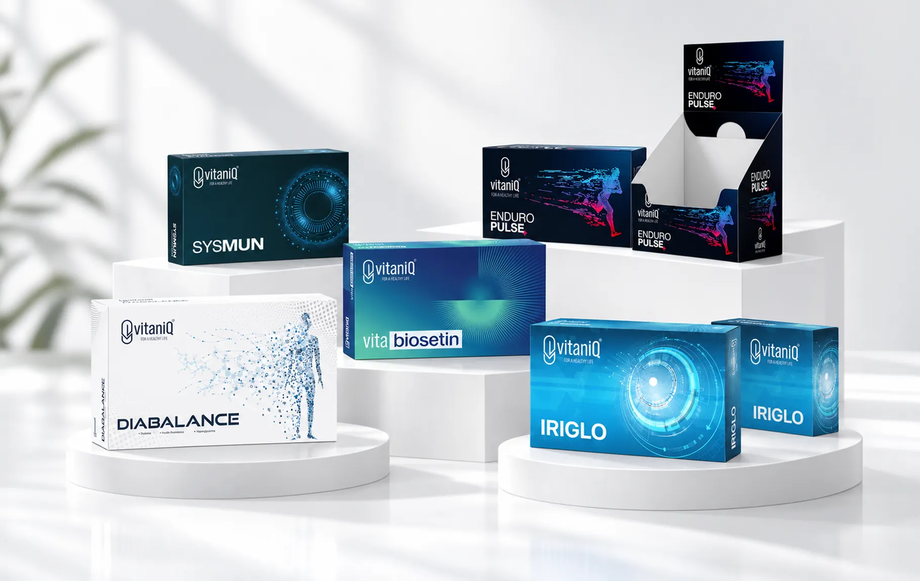
All pillars of brand transformation in one unified system.
The Challenge
In the dietary supplement industry, consumers demand utmost clarity regarding active ingredient purity and dosage safety. Confusing, text-heavy labels create friction, while overly sterile designs fail to inspire lifestyle vitality.
The Result
Vitaniq achieved authoritative shelf presence across pharmacy displays and digital marketplaces, establishing rapid brand recognition, high checkout conversions, and enduring consumer loyalty.
Our Approach
We balanced clinical white canvases with vibrant chromatic accents mapped to functional health pillars (immunity, vitality, bone health, cognitive focus). Ingredient concentrations and daily dosages were organized into clean, legible information cards.
Tangible assets delivered from strategy through to execution.
Category & Portfolio Architecture
“Cohesive packaging architecture segmented by functional health benefits.”
We established master packaging layouts ensuring unbroken brand coherence across capsules, effervescents, and liquid extracts.
Active Ingredient & Information Hierarchy
“Crystal-clear active nutrient and dosage panels building instant trust.”
We structured nutrient reference values, daily intake guides, and certification seals into an effortlessly scannable information layout.
Functional Chromatic Coding System
“Functional color coding guiding consumers to their target supplement in seconds.”
We engineered a distinctive color taxonomy distinguishing immunity, energy, sleep, and joint care segments at shelf level.
Retail & E-Commerce Shelf Standout
“High-contrast visibility engineered for physical shelves and digital marketplaces.”
We fine-tuned typography and chromatic contrast to maximize visual punch on retail pharmacy shelves and mobile e-commerce listings alike.
How We Approached It
An end-to-end process, from strategy to launch.
- 01
Strategy
We built a solid base with market and competitor analysis, positioning and messaging architecture.
- 02
Identity
We designed a trustworthy, modern and memorable visual identity.
- 03
Digital Product
We designed the product journey with a user-centred interface and smooth experience.
- 04
Launch
We delivered a strong launch with website, marketing assets and campaign support.
İlgili diğer başarı hikâyeleri.
The next strong story could be yours.
Let's clarify your brand and accelerate your growth.
Start a Project