

Cosmore Packaging Design
Shelf-stopping packaging and label architecture conveying instant clinical trust and cosmetic appeal.
We crafted a unified packaging identity for Cosmore Healthy Hands, bridging clinical efficacy with cosmetic elegance to capture immediate consumer trust at the point of sale.
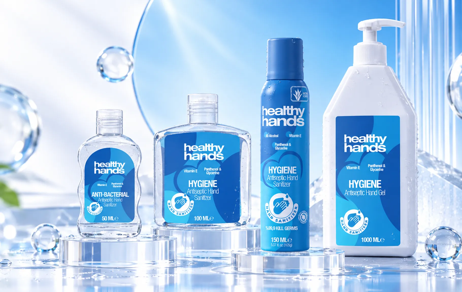
All pillars of brand transformation in one unified system.
The Challenge
Personal hygiene and sanitizer aisles are flooded with sterile, indistinguishable medical clichés. Consumers face either cold clinical jargon or amateurish labels lacking credibility, stalling purchase intent.
The Result
The product line established an immediate premium presence across retail chains and pharmacy networks, accelerating consumer brand trial and driving high repeat-purchase loyalty.
Our Approach
We developed fluid organic curves evoking hydration and purity, balanced by fresh clinical hues and bold ingredient badges (aloe vera, glycerin, alcohol %). The system scales seamlessly from pocket mists to high-volume pump dispensers.
Tangible assets delivered from strategy through to execution.
Shelf & Category Positioning
“Replacing clinical sterility with cosmetic appeal and dermatological trust.”
We separated the brand from generic competitors, positioning it as an elevated, trustworthy personal care staple.
Packaging & Label Architecture
“Flawless visual coherence across diverse packaging shapes and volumes.”
We established master visual rules safeguarding logo prominence, key claims, and barcode legibility across all container formats.
Consumer Benefit & Claim Architecture
“Scannable benefit badges driving instant checkout decisions.”
We designed unambiguous graphic badges communicating hydration, dermatological testing, and protective efficacy within 2 seconds of shelf scan.
Omnichannel Product Line Strategy
“Unified retail shelf impact and high-contrast digital thumbnail performance.”
We engineered packaging optics optimized for both physical supermarket shelves and high-contrast digital marketplace thumbnails.
How We Approached It
An end-to-end process, from strategy to launch.
- 01
Strategy
We built a solid base with market and competitor analysis, positioning and messaging architecture.
- 02
Identity
We designed a trustworthy, modern and memorable visual identity.
- 03
Digital Product
We designed the product journey with a user-centred interface and smooth experience.
- 04
Launch
We delivered a strong launch with website, marketing assets and campaign support.
İlgili diğer başarı hikâyeleri.
The next strong story could be yours.
Let's clarify your brand and accelerate your growth.
Start a Project